
BVA's ADFC Radturenkarte
This post is — I hope — the first of a series dealing with the construction of maps, especially cycle maps. What do they look like? Are they convenient? Which audience do they target? What are the conventions used? Which information is represented and which is left aside? So many interesting questions one can ask about a map. Actually, I am not the only one who is interested: such brilliant map makers as the  developpers do learn from paper maps.
We will start today with the series of cycle maps ADFC-Radturenkarten published by the German media company  (short for Bielefelder Verlag), one of the many German-Austrian cycle map publishers like Kompass, Publicpress or Verlag Esterbauer.
 (in full length: Allgemeiner Deutscher Fahrrad-Club) is the German cycle federation, “[working] with cities, state and federal governments to improve the conditions for everyday cycling as well as cycling for tourists” (source). The ADFC-Radturenkarte collection they edit together with BVA is one of the two existing collections of bike-touring maps with an extensive coverage of Germany. (The other being Kompass’s Fahrrad- und Mountainbikekarte collection.)
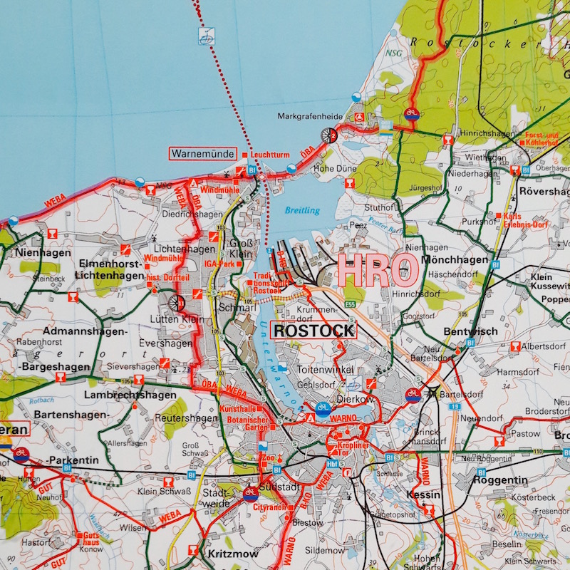
The Rostock area (Germany) on BVA’s ADFC Radturenkarte. No hope crossing the center of the Mecklenburgian capital with this map, designed more for the countryside than urban areas. The big intriguing letters HRO are a reference to some acompanying (paying) touristic brochure. Can you guess what GUT or WEBA mean?
With a scale of 1:150000, the map lack details, especially in urban areas. No hope navigating within Rostock here! On the other hand, a tough cyclist would cross the entire map (ca. 165 km between Schwerin and Neubrandenburg on the one commented here) in a little less than 2 days. A more detailed map, thus covering a smaller area, would force such a cyclist to frequently shift maps.
My favourite feature of the map is the visual importance given to the bike network, painted with vivid colors, in comparison with the rest of the road system. Motorways, especially useless to bikes, are depicted with a pale orange whereas the main axes of the cycling network stand out in red  . Even the local bike network in deep green
  overshadows the lavish yellow of the main roads. An extra highlighting
  outlines the presumably well-maintained long-distance paths of the national cycling network, Radnetz Deutschland.
I especially like to see the logos of the marked itineraries (
 ), logos that you then easily spot on the traffic signs. However, it was maybe not necessary to duplicate the labelling with redundant yet eye-disturbing capitalised red route names, like GUT, cryptic abbreviation for Guthaus Rundweg or WEBA for Wetlischer Backstein Rundweg on the Rostock map hereover.
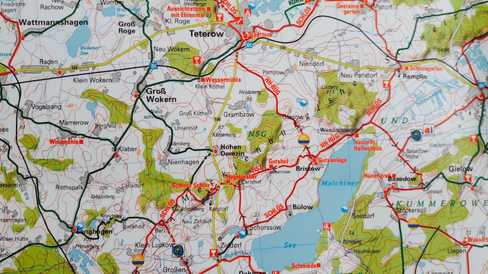
Teterow and lake Matchiner (Germany) on the BVA’s ADFC Radturenkarte. The legend is rich but not cycling-specific:  sign for repair shops,
  for recreationnal bathing,
  for countryside gesthouses,
  for campings and
  for hostels. Where are supermarkets and water points? As a sidenote, one can notice the text “Meklenburgische Schweitz” spanning an entire region — a common feature of paper maps rarely seen on the web.
The mappers also provide some information about the path condition: road sections where cycling is altogether forbidden  , diamons-shaped line for poor road surface
  and dotted lines
  for dangerous sections outside bike lanes. I have seen richer information.
Yet another interesting feature: even though it is a hard task at this scale, the map designers have chosen to maintain the display of the relief. They even underline sections that could pose problem to cyclists with clever V-shaped signs of two forms: ![]() for slopes between 3 and 7% and
for slopes between 3 and 7% and ![]() for steeper ones. In Denmark, information about relief is hardly useful, but when crossing Europe, it is essential, like here in the “Mecklanburgian Swiss”.
for steeper ones. In Denmark, information about relief is hardly useful, but when crossing Europe, it is essential, like here in the “Mecklanburgian Swiss”.
In summary, the ADFC series is a good, large-scale map, designed more for planning the travel of the day, than for actually finding your way on the bike.